


How to Letter a Quote for the New Year in Your Bullet Journal
Hello! This is Lisa (aka @nolalettering), and I’m here to show you how to create a stunning composition of your favorite new year’s quote for your journal to start off this year. We'll go through a step by step process of creating a lettering composition and share tips and tricks on how to spice things up with different lettering styles and doodles. So if you’re ready, let’s get lettering.
Supplies For Lettering
Before we jump into the lettering, let’s talk supplies! In general, you can use any pencil, pen and paper you have on hand, but to make your composition more interesting, you can consider adding color, highlights, and shadows.
For this tutorial, I will be using the following:
- A&O 8x8 Dot Grid Notebook
- A variety of Acrylograph Paint Pens
- White A&O Gel Pen
- Pencil
- Eraser
- 0.5 Fineliner
- Gray brush pen
If you plan on purchasing anything from Archer and Olive, don’t forget to use my affiliate code nolalettering to get 10% off!

Choose Your quote
Before we can letter, we need to decide what to letter. If you already have a favorite quote related to new beginnings or new years, you can skip this step and go right onto the next section. However, if you’re like me and don’t really have any favorite quotes, you can turn to everyone’s favorite search engine, Google. Type in whatever you’re looking for, and see what pops up and piques your interest - some keywords to search for include new year’s quote, funny new year’s quote, sarcastic new year’s quote, etc. Pinterest is also a great resource.
After an extensive search, I’ve decided to letter “the best is yet to come” for today’s tutorial. When you go to choose your quote, don’t choose anything too long, especially if you’re new to lettering. It makes it that much more challenging to create a cohesive and aesthetically pleasing composition with long quotes. Try to stick to around 5 words - not too little, not too many. As you become more comfortable with lettering, you can tackle longer quotes. Another thing is to have a variety of word lengths in the quote. For example in the quote I’ve chosen, short words like “the,” “is,” and “to” can be used to fill in spaces that inevitably come about in a composition.
Layout your quote
Next up we’re going to decide where we want to put our words. There are so many different ways to lay out your quote, but for this tutorial, we’re going to keep the shape of our journal in mind and try to create a square-ish or rectangular-ish layout.
With this in the back of our minds, the next thing we want to do is to consider which words in the quote are the most important or that we want the focus to be on. These words we'll want to make bigger and in different lettering styles in order to draw the viewer's eye. In my case, I’m going to make “best,” “yet,” and “come” the main focal points, and all the other words will be smaller.
Now I’m going to draw squares, rectangles, and lines where I want my words. This doesn’t have to be the exact layout I'll end up with. It gives me a general idea of where I want to place my words without having to write out each word. This is helpful because if the words end up not fitting or I hate the layout, I’d only have to erase the shapes and not all the words. Use shape sizes that correspond to the word size. For example, “the,” “is,” and “to” have smaller shapes, not only because I want them to be smaller in size, but also they’re just shorter words.

As you can see, I’m not making all my words straight across. Straight across is the easiest way to lay out a composition and also the easiest to read. However, I feel that having some movement and curves in a composition makes it even more eye-catching, so I’ve added a couple waves. This is where the short words come in handy. I can tuck them into the spaces that show up underneath or above these curvy words so I don’t have too much empty space in my composition.
Write Your Words
Now that we know where we want our words, it’s finally time to add in the actual words! Fill in the shapes with the corresponding words using basic monoline lettering or your basic handwriting. Don’t worry too much about lettering styles just yet, except if you want to include any script-type style. In my case, I wanted to do “to” in faux calligraphy so I wrote it out in cursive first.

Once I've got the words all set where I want them to be, I'm going to add in the lettering styles. This is a subjective step - add whatever style you feel most comfortable with or think would look good. However, I am going to give you a few tips to help you decide if you’re not sure.
- Don’t add too many styles as that can get distracting. Instead, focus on one or two styles and work to change those slightly for each word. For example, in my piece, I mainly decided to work with block letters - some have hard corners and others rounded. I played with the sizes of the letters and extended the top bar of the T in “best” and the descender of the Y in “yet.” Playing around with descenders and ascenders is my favorite way to change things up, and they’re also great for filling any empty spaces that might pop up.
- Make your not-so-important words all the same size and style. This way, your more-important words will stand out even more. For me, I made “the” and “is” the same size and style.
- Don’t be afraid to make changes from your original sketch. I was originally going to do a faux calligraphy style for “to” but decided that would stick out too much since everything else is in the block letter style.
-
Add in doodles! And banners! There was extra space between “yet” and “come” so I made “to” have a little banner. It does draw the viewer’s eye a bit more than the other not-so-important words, but it’s small enough that it doesn’t detract from the big words.
I also added in doodles of champagne glasses because there was that extra space after “yet.” Since we’re doing this for New Year’s, I felt like that was an appropriate doodle along with the stars that I used to fill the rest of the empty space. As you can see, the final composition is more or less a square shape, and that’s how I knew where to add in doodles.

Ink time!
Now comes the hardest part, in my opinion. Inking. Oftentimes my sketches look good, and then I go to ink it and it starts looking terrible. Then, I am filled with regret. However, as I continue with coloring, adding details, etc., things start looking good again! All this is to say, trust the process. Inking can sometimes lead to despair, but it does get better if you stick it out.
Normally I do black and white lettering, but it’s the New Year! Perfect time for some color. You can choose to use color or stick to black and white, completely up to you. Outline your words with the colors you’ve chosen and then start coloring. It doesn’t have to be perfect because you can fix small mistakes as you go along. I’ll have a Youtube video at the bottom where I talk more about this, so don’t worry if you color outside the lines or if your lines aren't straight. These are fixable even after you ink. Also, straight lines are overrated.

Once you’ve finished coloring everything in, you can stop here and have a beautifully lettered piece, or you can do what I do and add more details. Sometimes it’s really hard to know when to stop. But for me, there are a few things I always do to each composition I create - add highlights with a white pen, add shadows with a gray marker, and darken any black lines I’ve used. For example, in my champagne glasses, I go back over the lines again with my fineliner because it makes the black that much darker. Also, if you’re coloring with Acrylographs like I did, it can cover some of the original black lines, so going over it again will make your black pop.

Et voila! A wonderful new year’s quote composition for your journal is now complete. I hope this blog was helpful and easy to follow, but if it wasn’t or you’re more of a visual learner, the Youtube video below may be helpful. I also talk about some more tips and tricks in it.
Coloring Page Printable
I have also included a coloring page printable that you can color and stick in your journal!

Inspiration
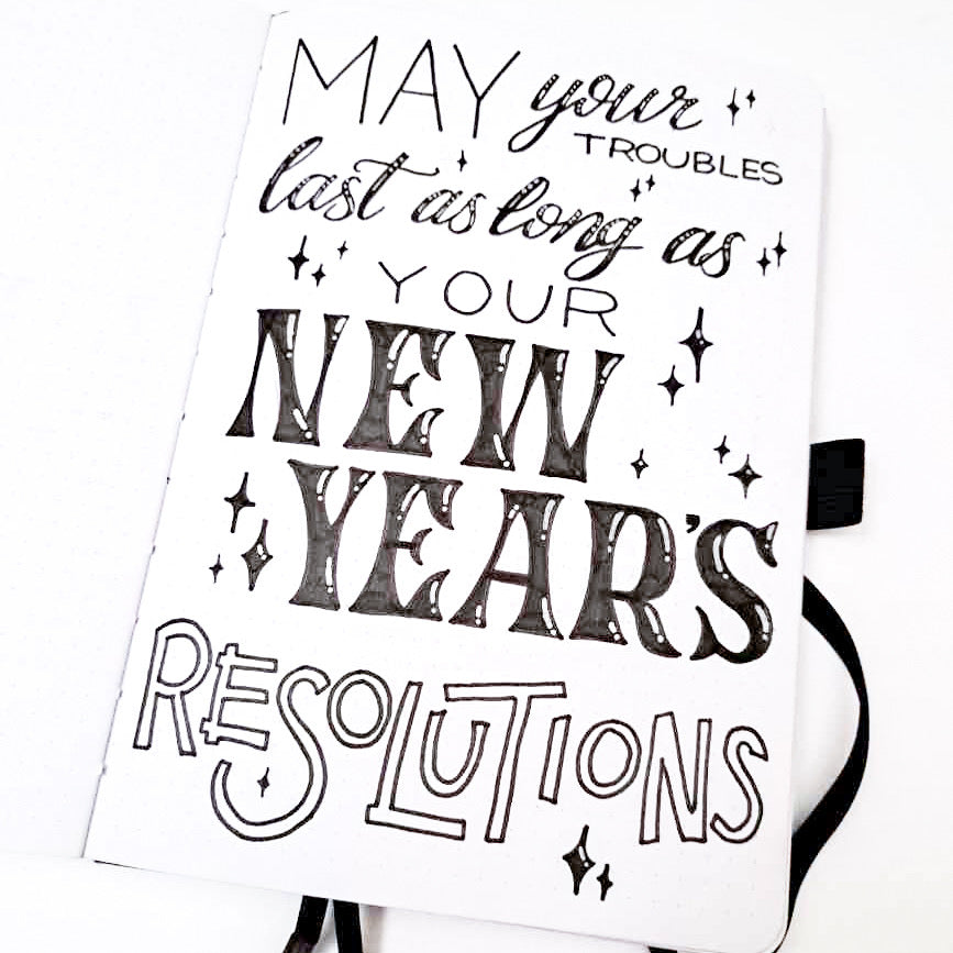
And just in case you need some more ideas, here’s a tutorial on including florals in your lettering, and below are a couple new year’s quote compositions from Helen Hadfield (@artistnamedhelen) to give you some more inspiration.

Thanks so much for following along, and if you do create your own new year’s composition, please share with us on social media and tag me, @nolalettering, on Instagram along with @archerandolive, @archerandolive.community and use the hashtags #AOShare and #archerandolive so we can see your beautiful creations.