


Hello everyone! It is Erin Floto from @erinflotodesigns here. I am here with a fun and creative bullet journal challenge that can help pick your next bujo theme. One of the things I love to do is force myself to think of out of the box themes for my bujo monthly setups. So I am challenging you to work outside of the box this month as well! I picked 3 Acrylograph pen colors using a random wheel and used those colors to inspire my monthly bullet journal theme.
But first, here are the items you will need:
- Acrylograph/Calliograph Pens - I used Acrylograph pens because this setup was done in my Archer and Olive blackout notebook, but you can just as easily do this with Calliograph markers. I picked a variety of pens that had pen names on the tube of the pen or were from the primary collection.
- Archer and Olive Notebook - As mentioned, I did this in my wand blackout notebook but any A&O notebook would work just fine!
- Random Wheel Picker - I used wheelofnames.com to randomly generate the pens that I would be using in this setup.
- Creativity - As I mentioned in the intro, the purpose of this challenge is to think outside of the box so let your creativity bloom with each color pen you pick!
Picking the Acrylograph Colors
The first set in this monthly setup is to pick out a bunch of color options to input in your wheel. I picked out over 30 pens and input those pen names into the wheel. I included some pens that do not have pen names on the barrel, such as colors from the primary, glitter, and metallic collections. For those I input “Primary Red,” “Metallic Lime Green,” or “Glitter Light Blue,” for example. For the pens I picked out that had names, I simply input those into the wheel.
First up, the wheel selected “Mellow Tangerine” from the Amanda Rach Lee collection. The color is a beautiful muted orange. My mind first went to an orange-sicle slushie for the theme. I’m not sure if that is because I was hungry when I was filming! After the winner was selected, I removed that color from the wheel so that I could get 3 different colors.

Next, I spun the wheel and it landed on “Primary Red,” from one of the first Acrylograph collections, the Primary collection. Now my mind was wandering into the land of fire, Leo or Gryffindor because of the hot tones. This theme I was planning this for was April, so much different from the blues and purples I was thinking to go along with the rainy months. But that is ok! I removed Primary Red and onto the next color!

I spun for the final color and let me tell you, that wheel was SO close to “Flamingo Red” but man I was so excited when it squeaked out to pick “Heliotrope.” Named for the flower, this purple is slightly paler and more muted than a primary purple color. And this is when my brain nearly shut down, unsure of where I could possibly go with this theme.

Now, I only picked 3 colors but if you are doing this challenge yourself, don’t feel the need to limit yourself if you typically work with more colors in your bujo setups.

Coming Up With a Theme
Well, all of the fire-type themes were out once the purple came into play so I had to wrack my brain for a theme. Here are some additional themes that passed through my mind:
- Sunset - I ultimately ruled this out because I have been saving a sunset theme and I wanted to be able to blend colors (possibly watercolors) for that theme. So I did not end up picking it. However, I did incorporate some clouds as a nod to a theme was a close second.
- Clowns - My brain immediately thought of this and I shuddered thinking of that. So I threw that idea quickly in my mental trash can.
- Abstract Art - I didn’t ultimately pick this theme because it felt like taking the easy way out. Pretty much any combination of colors can be combined to make an abstract art theme.
- Bouquet - Similar to abstract art, I thought that a bouquet of flowers was easy, minus the fact that there was no accompanying green. Plus one of the colors is literally named after a flower.
- Paint Strokes - Just like several of the aforementioned ideas, this one did not feel like I was really pushing out of the box.
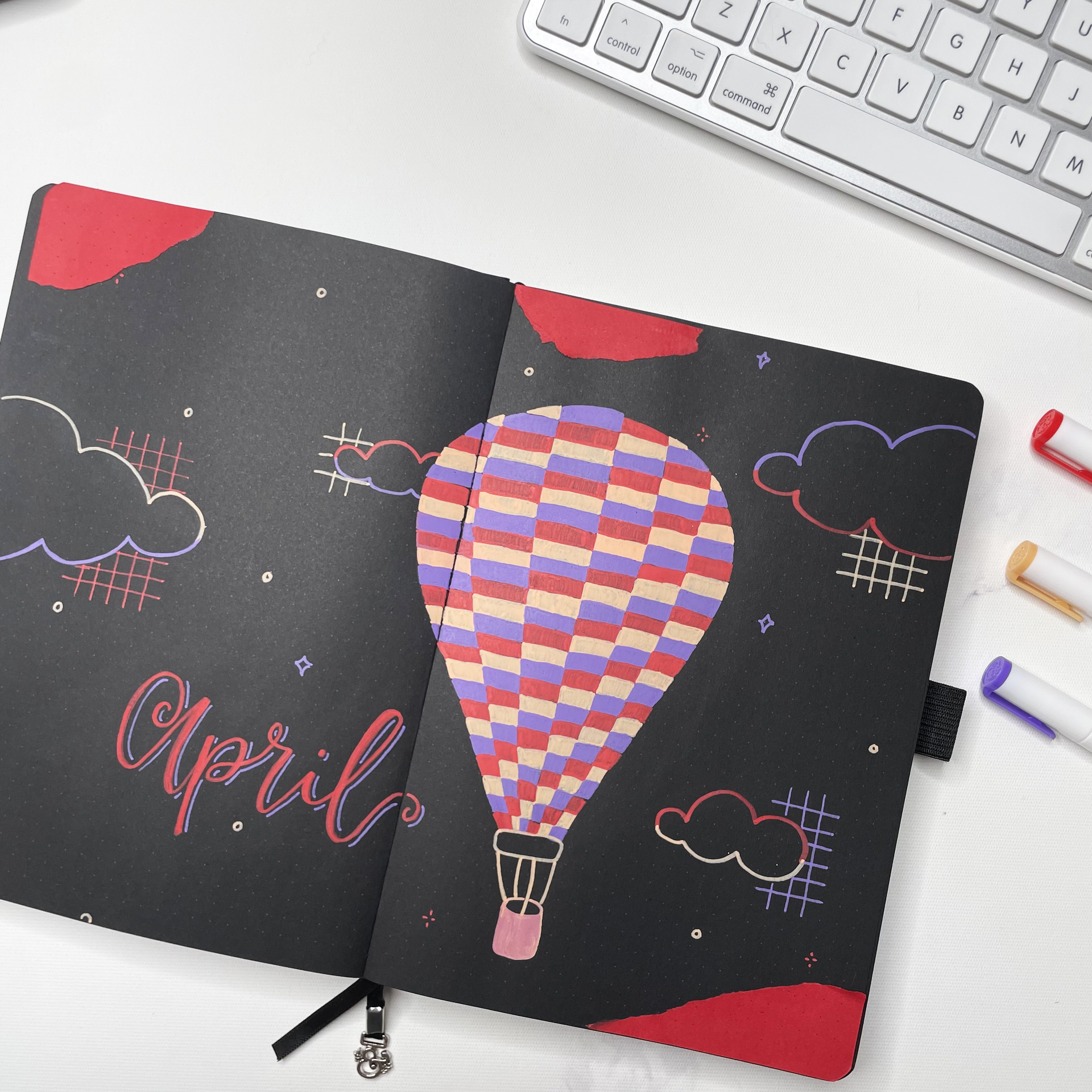
I finally came up with the idea of hot air balloons. This is a theme that has been done quite a bit in the bullet journaling community but I had never contemplated doing before. So it felt like a theme that is versatile and that I could make my own with these colors. Particularly because I am doing the theme in a blackout notebook. It feels like it elevates it slightly because it is almost like taking a hot air balloon through a dream or into the night sky. If you are looking for some hot air balloon designs that you can print and color in for your own theme, here is a printable that may work for you!

Sketching the Cover Page
One of the things that I have loved doing in my bullet journal lately is adding some small designs to accompany the main theme. I think that doing this fills in negative space and makes the page look more complete because it isn’t one big design with a lot of space around it. For this cover page, I sketched in my main hot air balloon with a stepping design. I thought that doing this design would be a great idea because all 3 colors are weighted equally and I was doing each of my randomly picked colors justice. I also sketched in some clouds designs as a nod to the sunset theme that came in second place. In addition, I added stars, as if the balloon were flying in the night sky and a nod to being in a dream.

My Finished Theme!
Wow that cover page was definitely time consuming because of the design I used for the hot air balloon but the effect is so beautiful and I am so glad that I went with this theme. One of the fun things that I did on this spread is play around with combining and blending the colors to make the basket of the hot air balloon. None of the colors really fit the idea I had for the basket so I used an acrylic block to lay down each of the 3 colors and blend them together to make the color for the basket. I truly love how that effect came out!

As some final little touches, I added 2 colors to the outline of the clouds to mimic how a sunset looks on clouds, the stars and circles to fill negative space, the grid to balance all of the curved lines with a little structure. And finally I tore up some red dot grid paper from Archer and Olive’s rainbow notepad since that is a recurring element in all of my themes for 2023. I just love the extra texture and pop of color it brings to the page.

If you want to watch how this theme comes to fruition, here is a video of me spinning the wheel, coming up with a theme, and ultimately setting up the cover page that you see above. I hope you enjoy!
I hope this blog, video and printable gives you the inspiration you need to create some really creative themes! Thank you so much for joining and please tag @erinflotodesigns and @archerandolive and #aoshare on Instagram with the random colors that were picked and what theme you came up with!!


0 comments