Hi! Lisa (@nolalettering) here to give you some tips and tricks on creating fun and unusual lettering compositions for your bullet journal or sketchbooks. Coming up with cohesive and interesting lettering compositions can oftentimes seem quite daunting, especially when you’re staring at a blank page. However, creating lettering compositions is a great way to express yourself and have fun with your art. You can use it as a monthly cover page if you’re into bullet journaling or creatively express your favorite quotes and thoughts in your sketchbooks. Not only can you use the lettering skills you learn here in your journals, but you can also create greeting cards for friends and family or stickers with your favorite quotes beautifully lettered and composed. In this blog, I’ll give you some methods to not only develop different layouts but also conquer that fear of the blank page.
Materials

- Archer and Olive journal
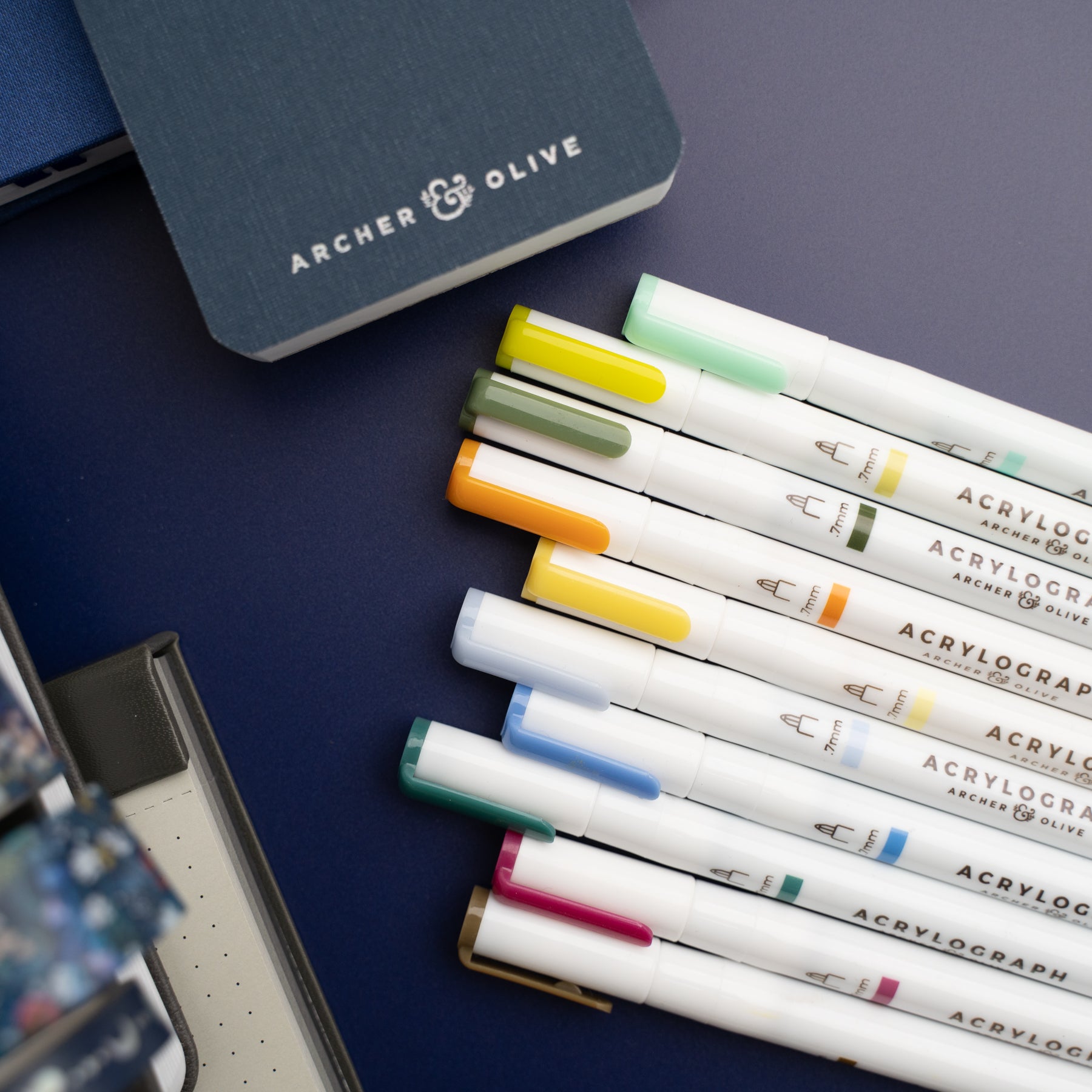
- Archer and Olive Acrylograph
- Pencil and eraser
- Color pencil
Don’t forget to use my affiliate code nolalettering to get 10% off!
Step 1. Draw a number of random shapes on your page

In a previous blog post, I talked briefly about creating lettering compositions using your quote as inspiration for the overall shape of your composition. For example, a quote about love can use a heart as a shape, a quote about the universe can use a planet or stars as shapes.
But what happens when your quote doesn’t have a specific theme or noun that can be easily represented in a shape? That’s ok, you can also still use geometric shapes like squares, rectangles, circles, etc. But if you want to get even more creative, consider using weird blobs and uneven shapes like I did in the photo above. I tend to stick to blobs with rounded edges, but it is entirely up to you what kinds of blobs you want to create.
Do as many blobs as you like on that blank page. Not only do these blobs help in creating a composition, but as you’ve probably noticed, your page is no longer blank. The worry of messing up the page or being unsure of what to put down is gone!
If you like your journal to be full of finished products without the sketches, consider using a separate piece of paper for this exercise. However, I challenge you, if you are on a lettering journey, to embrace your sketches in your journal. This is part of your lettering growth, and one day, in the future when you’re a pro at lettering, you can look back at these sketches and see how far you’ve come. Not only that, these sketches could potentially inspire you for future compositions, so it’s a good idea to keep them around.
If you don’t know what kind of blobs to create, I’ve made a handout with a whole bunch of weird shapes to get you started and inspired.
Step 2. Write in your quote

Now it’s time to write in your quote into the various blobs. Try to fit all the words into the space you’ve allotted with the blobs. It’s ok if it looks weird or wonky or not perfect, this is just the sketch, not the final product. Some blobs work better than others, so don’t worry if some of the blobs don’t look good.
I always think of lettering composition as a puzzle or Tetris. You’ve got the pieces - all the words - and now you gotta fill in the space with the pieces. It’s also ok if you can’t fit the words exactly. You can add in simple doodles to fill in the space, such as stars, hearts, dots, and many others. You can also consider using flourishes and extending the crossbars, descenders and ascenders of letters to fill in space. Serifs can also come in handy as well.
Two things to keep in mind! Spacing is very important. Make sure the words and letters are evenly spaced as it will make your composition feel not too crowded or too spacious, but it also gives it a more cohesive and comfortable look. Legibility is the other thing that is important to keep in mind. It is easy to twist letters and words to fit the space, but is your quote still legible? Can someone see it and immediately know what order the words should be in or what the words even are? You don’t want to create something that looks beautiful but is difficult to read.
But the most important thing is your words do not have to fit perfectly into your shape. If you find a little area of your shape impossible to fill in, that’s ok! Leave it blank or fill it in with doodles. The shape is just to give you a general idea and get over the blank page fear.
Step 3. Add in the lettering styles

I find when I’m doing this kind of exercise where I’m filling in weird spaces that block letters are the easiest to work with, especially if you’re just starting out. Make your monoline letters a little bit thicker, and there you go!
If you want to make them a little more interesting, you can change the crossbar location (a little higher than normal, a little lower) or make your letters a variety of sizes and weights. These are all little things you can change that will make your letters look different.
If you are comfortable with lettering, then using a variety of styles is a great way to make it interesting. Add in some script, serif if the space allows, or use both lower case and upper case letters. The combinations are endless and don’t feel like you have to make it perfect. Remember, these are just sketches!
This exercise is a great way to practice, especially if you don’t have enough time to develop full lettering pieces. If you’re waiting for your doctor’s appointment or taking the metro, take advantage of these little lulls in time to practice instead of scrolling on your phone. Future you will be grateful for the extra practice. And as I mentioned earlier, you can always come back to these sketches for future compositions if you’re ever feeling blocked or uninspired.
If you are having trouble fitting the words into these weird shapes, check out this video where I demonstrate and talk through how I add in my words and styles.
Step 4. Choose your favorite composition and make it big

You can stop at step 3 or repeats steps 1 through 3 for other shapes if you don’t find any of your layouts to your liking. The more times you do these little thumbnails of weird shapes, the more comfortable you will be. So again, don’t worry if your first try doesn’t result in anything that tickles your fancy. Try, try again - maybe with different shapes or a different quote.
However, if you do find one layout that you like - make it bigger and into a final composition. Fill in your letters with colors and details. Add illustrations or doodles. Add in some shadow and highlights and there you have a finished lettering composition that’s not the usual square or rectangular shape that we see. It has curves and flow and it’s overall more fun, I think.
I hope you found this blog to be helpful and a little inspiring! If you do fill in some blobs, please share with us on social media and tag me, @nolalettering, on Instagram along with @archerandolive, @archerandolive.community and use the hashtags #AOShare and #archerandolive so we can see your beautiful creations.




0 comments