Hi, friend! I’m Maira, the creative behind Vial Designs. I'm so happy to be part of the Archer & Olive Ambassador team, sharing my first tutorial with you today. You can find me on Patreon, YouTube, and Instagram, as @vialdesigns. In this post, I’ll walk you through 7 easy hand lettering styles you can use in your bullet journal to make your pages look creative and personalized — even if you’re a beginner! These hand-lettering fonts are perfect for adding flair to your bullet journal headers, quote pages, or weekly spreads.
See exactly how to improve your bullet journal lettering in my tutorial video (or keep scrolling if you prefer a step-by-step photo tutorial):
Tools I’m Using:
For this tutorial, I’m using some of my favorite Archer & Olive supplies. You can find links to all the products below — and if you want to save some money while supporting my work, use my code VD10 to save 10% on your Archer & Olive purchase.
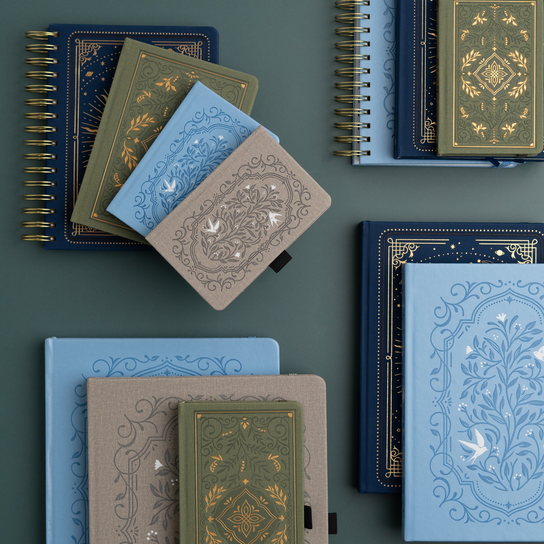
- Archer & Olive Dot Grid Journal – Songbird in Blue A5, 192 Pages.
- Calliograph Pens – double-ended brush pens with a fine and broad tip. I love using the fine tip for small lettering and the broad tip for larger titles.
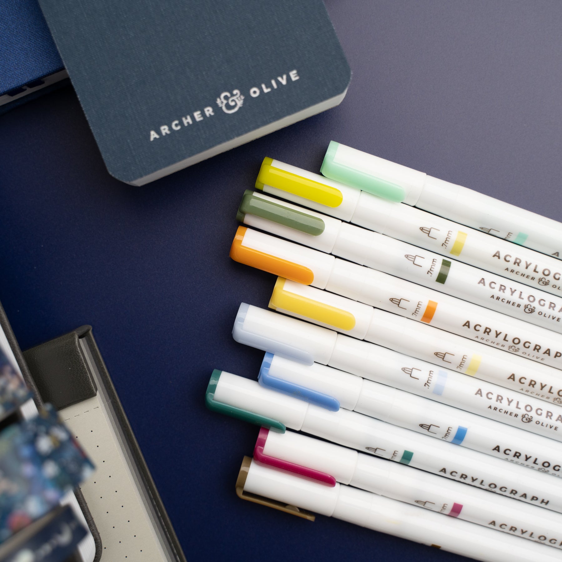
- Acrylograph Pens – these acrylic paint pens are great for block lettering, adding outlines, and layering colors.
- Fineline Pens – grab your favorite pen.
Now, let gets go over the hand lettering styles you can start doing in your bullet journal today!
Easy Hand Lettering Styles to Try in Your Bullet Journal Today
Style 1: Monoline Script Lettering
This is the simplest style and a great place to start. Grab your favorite pen. If you’d like to add flair and shine to your journal like me, use the Acrylograph Metallic Pens.
💡 Something to know:
Monoline script lettering is not the same as cursive, even though it looks similar. With Monoline Lettering, you should try to pause slightly between each stroke and go slowly as you’re making each letter. This helps you build control and get better letterforms. You’ll need to get used to making this small pause, as we’re going to use it later for faux and modern calligraphy. With cursive writing, you write continuously and fast.
Style 2. Faux Calligraphy
This is where things get a little more interesting! You’ll write your word in monoline lettering, then add an outline to thicken the downstrokes (the parts of each letter where your pen moves downward) by adding an outline.
It’s a super fun way to mimic calligraphy, even if you’re using a regular pen. I’m still using the Acrylograph Metallic Pens for this lettering style.
With faux calligraphy, you have the option of coloring in the outlines, leaving them blank, or even using different colors or designs inside the downstrokes.
You can learn more about faux calligraphy on the blog here.
Style 3. Modern Calligraphy
Now that you’ve practiced pausing between strokes and adding thickness, you’re ready to try modern calligraphy!
The trick to modern calligraphy is to focus on creating thin upstrokes and thick downstrokes using a brush pen.
A brush pen is a pen that has a flexible, brush-like tip. Brush pens can have small and large tips. When using brush pens to create modern calligraphy, the key is to use no pressure as your pen is going up, and apply pressure when going down when you’re forming the letters.
I’m using the Calliograph brush pens. These brush pens have double-sided, with small and large brush tips. These brush pens are great for calligraphy beginners!
Before you even start writing letters and words using modern calligraphy, you should focus on mastering the basic calligraphy strokes. These strokes or variations of them are what you’re going to use to form the lowercase letters.
Practicing the basic calligraphy drills will help you achieve consistency with your thin and thick strokes and letter forms.
You can get free lowercase calligraphy practice worksheets on the Archer and Olive blog here.
Style 4. Block Lettering (Regular Pens)
Block lettering is perfect to create titles or headers, or to pair it with faux or modern calligraphy to create quote pages. Use your monoline or fineliner pens to draw structured letters - sans serif-like.
Keep your spacing consistent and your lines clean.
You can make small changes to the letters to create different block lettering styles. For example, make your letters thinner and add the cross bars higher for narrow block lettering. Do the opposite - wider letters with lower cross bars for wider block lettering. You can also mix uppercase with lowercase for another block lettering style - this is my personal favorite!
Another way that you can play with block lettering is by doing wavy lines instead of straight horizontal lines when it comes to the crossbars. Whenever possible, combine the crossbars of the letters, like the crossbar of the H with the middle line of the E. This ligature makes the lettering super fun and creative.
Style 5. Double Line Block Lettering
Once you’re comfortable with basic block letters, add a second line inside to each of the downstrokes of the letters.
This lettering style is simple, playful, and adds instant personality to your pages.
Style 6. Block Lettering with Brush Pens
For this version, use your Calliograph pens — you can use the fine tip for smaller lettering or the broad tip for larger headers.
This lettering style builds on your block lettering with regular pens, but this time using brush pens. For this type of lettering, you don’t need to worry about the pressure you’re applying to your brush pens. We want all the strokes of the letters to have the same width.
Style 7. Outlined Block Lettering + Shadows
We’re building on our previous hand-lettering idea. Same block lettering with brush pens, but this time we’re adding outlines and shadows.
This one is bold and graphic! Start with your block letters, then add an outline around each one using a contrasting color. You can also add a soft shadow to make the letters pop even more.
I’m using a gray calligraphy pen to add shadows to the block lettering, but you can use whatever color you prefer to create the shadow. Add a line to the right and slightly to the bottom of each part of the outlined block lettering.
It’s an easy way to make your words stand out and add dimension without needing complicated effects.
Download Your Free Lettering Practice Worksheet
To make it even easier for you to practice these lettering styles, I created a Free Lettering Practice Worksheet that goes perfectly with this blog post.
It includes the same 5 planner words — today, goals, to-do, notes, important — in all seven lettering styles.
You can download the free worksheet here, print it, trace the lettering styles, practice, and then start making beautiful lettering in your bullet journal!
Final Thoughts
I hope you enjoyed this 7 Easy Lettering Styles to Use in Your Bullet Journal blog post and found it helpful!
I’d love to see how you implement the lettering ideas you learned in this tutorial inside your bullet journal. If you share it on social media, be sure to tag @archerandolive and @vialdesigns using the hashtags #AOShare and #archerandolive. We’d love to see your work.





0 comments