


Hey planner babes! I’m Jess - a digital content creator just getting my toes wet in the Bullet Journal community. You can catch up with me on social media under @lovejessco (Instagram and Youtube). I have been working in the cardmaking industry for a few years now and always struggled to keep myself organized. Traditional planners just didn’t cut it for me. Then I found bullet journaling and something just clicked. There’s something magical about customizing a layout that fits your life perfectly and then having the flexibility to change it whenever things don’t go quite as planned. Let’s face it - that’s almost always!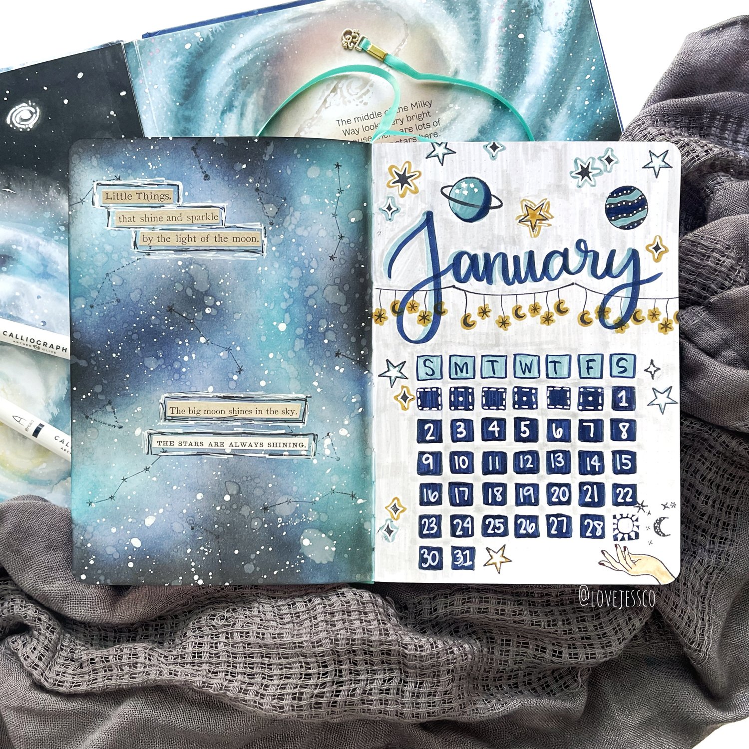
Now that I’ve had some time to dabble in the world of Bullet Journaling, I’ve starting finding ways to incorporate some of my favorite techniques and ideas from cardmaking into my planning. One of my all time favorite techniques for cardmaking is ink blending and I’m so excited to share it with you today. We’re going to create a cover page for the month of January (but you can use this theme any month of the year!). There are written instructions for you below, but if you’re more of a visual learner, I’ve included a time lapse video as well.
Supplies For Mixed Media Bullet Journal Spreads:
- Archer and Olive Notebook - this paper especially holds up to mixed media projects!
- Archer and Olive Acrylograph Pens - you can use these paint pens to write, doodle and color with ease over different mediums.
- Archer and Olive Calligraph Pens - write, blend or even use these brush pens as watercolors to add different elements to your project.
- Celestial Acrylic Stamps and Stickers - allows you to add intricate celestial elements to your spread.
- Distress Inks - great for covering a larger area in color!
- Scrap paper - adds different textures and dimensions to your project.
To get started, I used a piece of scrap paper slightly larger than my journal page to prevent and ink getting on other pages or my journal cover. I tucked the scrap paper behind each of the pages I was working on. For my ink blending, I used a few ink pads called Distress Inks. I used an ink blending tool with a foam pad to apply the ink to my planner. To get the ink on the foam pad, you just rub the foam directly on the ink pad in a circular motion, then do the same circular motion to apply the ink to your planner page. I like to start with my lightest color first and then add darker colors as I go. To see how the blending comes together, check out the time lapse video below!
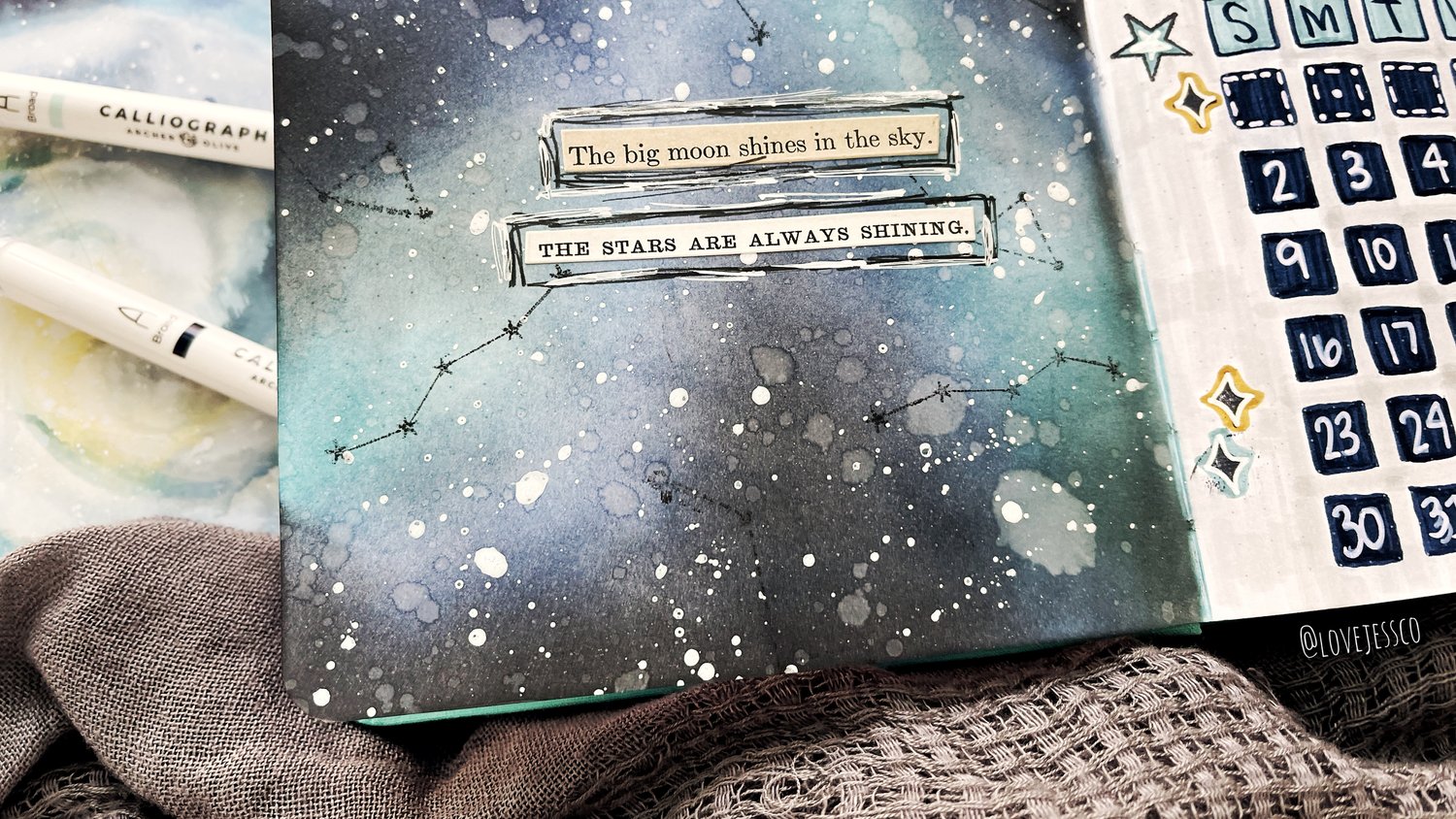
Once the ink blending was done, I was ready to add a little water to my page to get a distressed effect. The cool thing about Distress Inks is that they react with water. I spritzed some clean water into my hand and then flicked the water droplets on to my planner page. You don’t need a ton of water here, a little goes a long way. After waiting a few moments to let the water work its magic, I used a clean paper towel to blot up the excess water. When I removed the paper towel, the ink had lifted from the spots where water had pooled. It gave my ink blending a really cool texture and dimension!
Next, I wanted to add the feeling of a night sky or outer space, so I grabbed some Acrylic Gloss Spray. This is basically liquid acrylic paint in a spray bottle. I took the lid off and tapped the lid over my journal page. Little white splatters fell all over my background - they look like little stars! Adding splatters is one of my favorite ways to add a little something extra to my art.
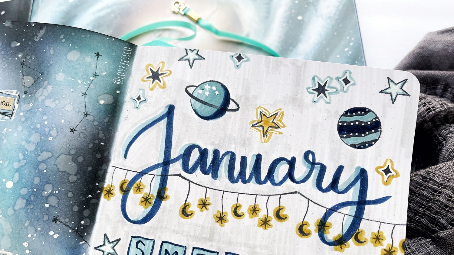
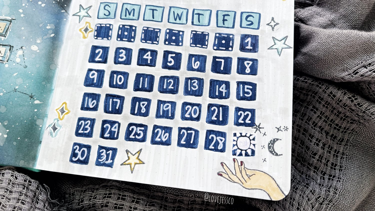
While the left page was drying, it was time to move on to our Title and Monthly Calendar spread on the right page. I was so excited to use my new Calliograph markers for the first time on this spread. I absolutely love all things markers and pens and these did not disappoint. I really liked having a brush nib and a fine brush nib to choose from. It made outlining and coloring a breeze. I drew boxes (2x2) for each day of the month and the day of the week abbreviations using the Jewel selection.
I used the adorable Celestial stamp set and black ink to decorate my title page. Then, I used coordinating Calliograph markers from the Jewel and Tropical selections to accent the stamped images. I used the larger brush nib to hand letter the month ‘January’ and drew the numbers in each of the boxes with the white Acrylograph pen. To give the page a more finished look, I used a very light gray Tombow Dual Brush Pen (#N89) to fill in the background of the page.
To finish off my spread, I stamped a few of the constellation images on the ink blended page. Then, I added a few stickers with star and moon quotes or words and outlined them with black and white pens.
I absolutely love how this spread turned out. I’m ready to get the new year started with my bullet journal. Making a cover page like this helps me feel like my journal has a more structured flow. I love being able to easily look back at each month almost like a chapter of my life. This process fills my creative needs for my journal and then I can decide if I want the pages in between each cover page to be simple or more detailed. I love the flexibility!
To see me set this up and a more in-depth explanation see this video:
Thanks so much for taking the time to read over my post today. I hope this gives you some ideas and inspiration for creating your own celestial cover page or monthly spreads. If you create anything with this inspiration in mind, be sure to tag us on social media ( @lovejessco and @archerandolive ) so we can see what you’re up to. I can’t wait to see what you create!
Hugs,
Love, Jess


2 comments
I loved this video! I haven’t used Tim Holtz’s ink pads but love the idea of using them in the Archer and Olive journals. I am curious why you picked the Distress Ink instead of the Distress Oxides. I believe that I heard Oxides are better for blending, but are slower to dry. Do you know if the Oxides bleed through the pages?
Goodness, isn’t that pretty.