Hi Friends! Sarah here, from the Archer & Olive Ambassador team and SHEdesignsKC over on Instagram. Today I’m so excited to talk about one of my passions - lettering!! And more specifically, today is all about Acrylograph lettering! When I started my first bullet journal in 2019, I wanted it to be a place where I could keep track of day to day tasks and events, but I also desperately needed a creative outlet. I was a brand new mom and I was bogged down in the everyday - laundry, feeding, diaper changing, cooking, grocery shopping, etc. I needed some fun! I wanted to spend some time making something pretty! So I started to get REALLY into lettering. I used my journal as a place to practice and experiment, and I had so much fun! Lettering is something I do almost daily now. Archer & Olive Acrylographs are perfect for so many lettering techniques - let’s dive in to some lettering play!
SUPPLIES
The supplies I’m using today are:
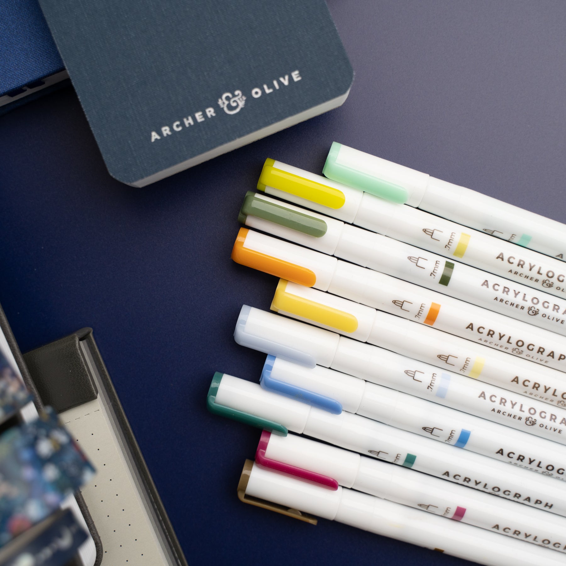
- Archer & Olive Acrylograph pens
- Archer & Olive Calliograph pen
- Archer & Olive notepads
- Pencil and eraser
If you’re shopping for any Archer & Olive products, I’d love for you to use my affiliate code to save on your purchase! SHEDESIGNSKC10 will save you 10%, and I’ll get a little commission too, which I appreciate so much.
PREP
Acrylographs are water based acrylic ink pens and they require just a little prep before going right in on paper. Each time I use these pens, I give them a shake for about 15 seconds. I always have scrap paper nearby and a paper towel as well. I test them out on the scrap paper to make sure the ink is flowing nicely before I start writing. If it’s not, a few presses of the nib on the scrap paper usually does the trick. If I have too much ink flow, I’ll use the paper towel to blot the nib. Once my Acrylographs are ready to go, it’s time to sketch. I prefer to do a pencil sketch before using pen when I’m lettering. At least, most of the time! I try to always use a really light hand with my pencil, but if it’s too dark, a kneaded eraser is a great tool for lightly erasing, but leaving enough pencil to still see guidelines. Sometimes, I use a light gray Calliograph instead of pencil. The Acrylographs are opaque enough that the gray ink will not be visible underneath. Okay, let’s letter!
FAUX CALLIGRAPHY
Calligraphy is such a beautiful style of lettering and the look can easily be created with Acrylographs, even though they have a bullet tip. The strokes in calligraphy follow the rule of thick downstrokes and thin upstrokes. So as you letter your word, make two strokes about equidistant for each downstroke and connect them at the top and bottom. Then one stroke for each upstroke. When you finish, fill in the space between the two downstrokes and you’ll have created faux calligraphy! You can follow the same thick downstroke, thin upstroke rule to do print lettering too, which is one of my favorite styles!

OMBRE
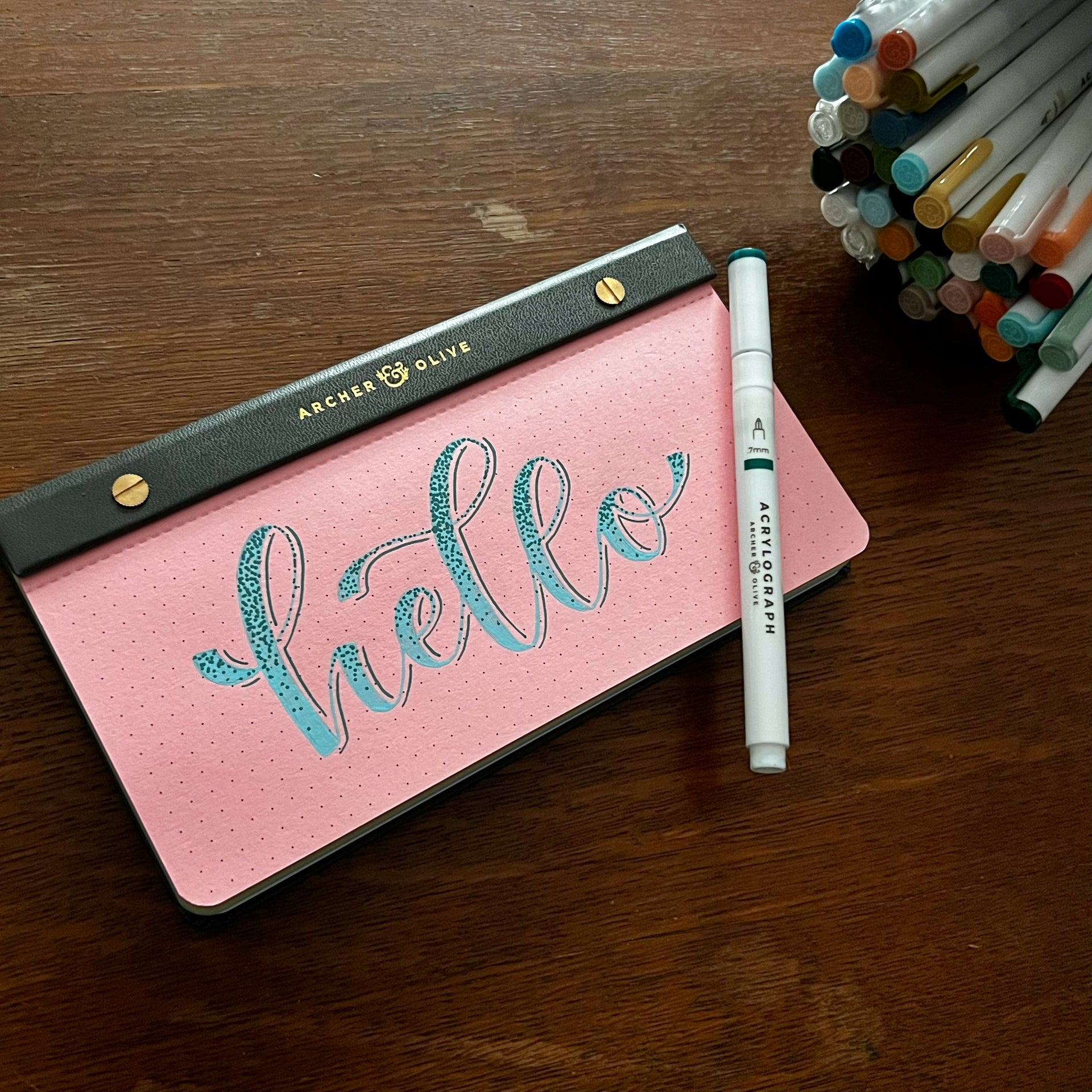
Ombre adds such a pop to lettering, and it’s really pretty simple to do! I like doing this effect on dot grid paper, because the dot grid makes it easy to maintain the approximate placement of the color change so it stays consistent for the whole word. For a subtle ombre shift, put down the lighter color of your letter first, then use a darker color to write in the remainder of the letter. Quickly go back to your lighter shade pen and gently drag from the lighter shade into the darker. This may get a little bit of the darker ink on your lighter shade pen, but you can just scribble a bit on some scrap paper, and that will come right off. I recommend doing just one letter at a time so your ink doesn’t dry before you get to the blending. You could also do a color block look by just making your different colors meet up and not blending them together. Both looks are great!
EMBELLISHMENTS

One of my favorite things about Acrylograph pens is how opaque they are! This makes them ideal for layering colors and layering colors is an easy way to have lots of fun with lettering! There are soooo many possibilities! Some of my favorite embellishments for lettering are:
- Stripes
- Outlining
- Dot gradient
- Centerline stroke
- Polka dots
- Flowers
My preference is to use a lighter shade of Acrylograph for the base letter, and a darker shade for whatever embellishment I want to add. The reverse works as well, but if you layer with a lighter shade, sometimes it takes more than one “coat”.

DROP SHADOW
Drop shadows are a great way to add some dimension to lettering! Sometimes it can take a bit to get the hang of drop shadows and where to add them. The trick is to pick a side of the letters where you picture a light shining. The opposite side of the letters is where the shadow would appear. There are different ways to do them too! You can have it right up against the edge of your lettering. You can leave a little space between the letter and the shadow. You could also do a little dashed line instead of a solid line shadow. All are fun and great options!
I’ve created a free printable for practicing and testing out these ideas. You can see how I used it in the image above. I hope you’ll check it out! There are a couple of hand lettered quotes you can color in however you choose. These would be great to cut out and stick in your journal when you’re finished! Plus, a little drop shadow placement practice sheet!
If you want to see each of these techniques in action, check out the YouTube video here! I had a blast playing around with all these ideas and I hope you’ll enjoy watching the process!
Thanks so much for hanging out with me and I hope you’re inspired to get creative with your lettering. Experiment and play are great tools for growth! Let me know your favorite style I tried out here. I’d love to know! If you’re looking for more on Acrylograph pens, there much more to see! I love this post for more on making these pens pop on your paper. So cool! Remember to tag Archer & Olive (@archerandolive) with your Acrylograph creations and be sure to tag me (@SHEdesignsKC) as well so I can admire your art! Talk to y’all soon!



0 comments