

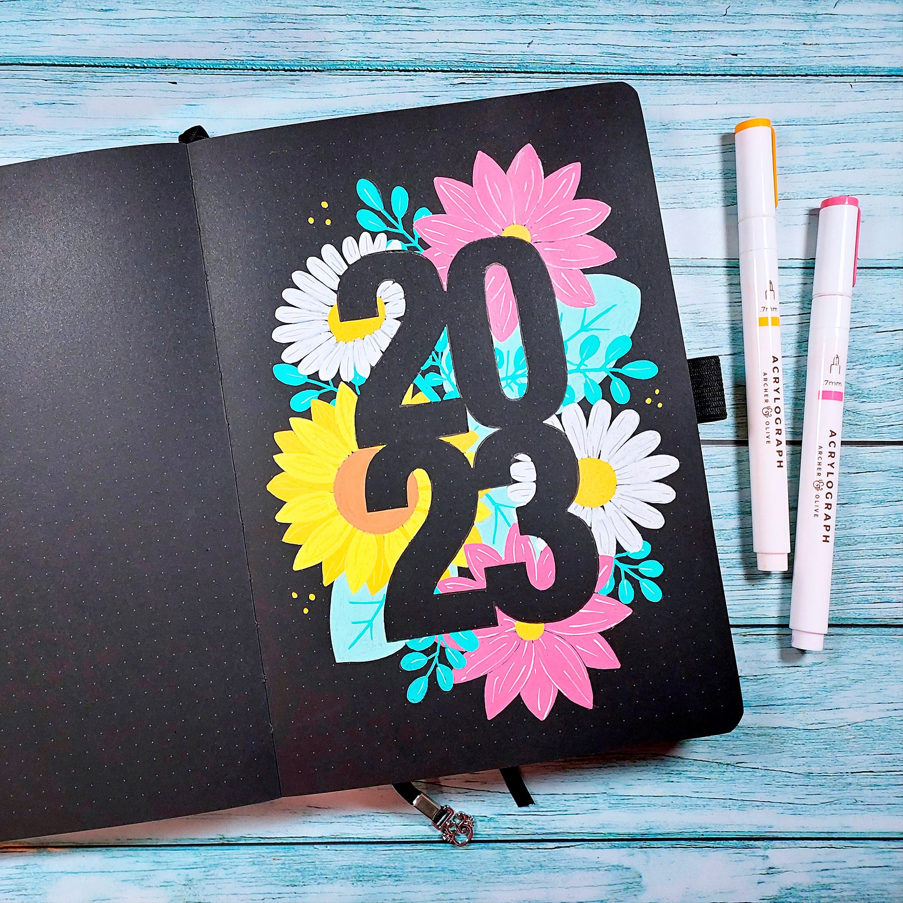

Hi! Neus @miss.meissa here, and today I’m going to be showing you how to draw and paint a super eye-catching cover page for the new year in your bullet journal using negative space lettering and flowers.
Negative space means that we are not going to paint the numbers on our bujo cover but the area that surrounds the numbers.You can also use this lettering technique for your monthly bujo covers, for a bullet journal spread, as bullet journal title ideas or for lettering composition.
BULLET JOURNAL SUPPLIES
- Archer and Olive Journal. I’m using a Blackout Journal, but you can also choose a white one.
- Acrylograph pens. I'm using the 0.7mm Tropical collection + light pink for some details.
-
Pencil, eraser, sketch paper and yellow transfer paper (if you want to transfer the sketch on black paper).
(You can use my affiliate code MISSMEISSA for a 10% off at archerandolive.com).

DRAWING THE LETTERING COMPOSITION FOR THE BULLET JOURNAL COVER
1. DRAWING THE NUMBERS
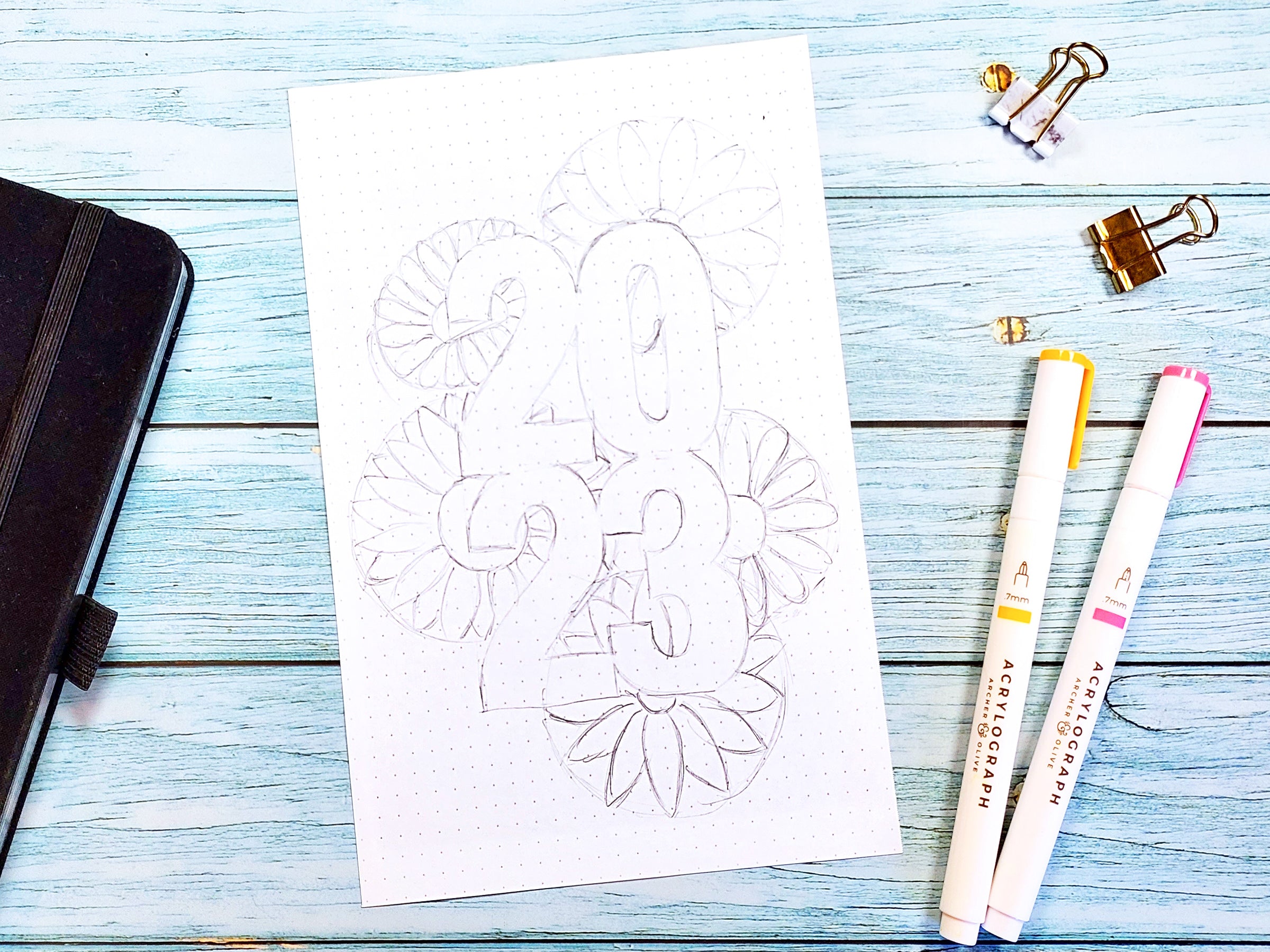
When I design a complicated or elaborate drawing for my bullet journal I always start by drawing the sketch on a separate piece of paper, the size of the page of my bullet journal. This way I can draw and erase without worrying about messing up the page and the final result will be cleaner.
The first thing we are going to do is to place the numbers, 2023. I'm going to divide the number into two and two, two above and two below, but you can put them all in a row or one below the other if you prefer.
Draw a rectangle in the center of the paper, in the space we want the numbers to occupy. Keep in mind to leave enough space for the flowers, the numbers should occupy at most half the width of the paper. Then we divide the rectangle in half both vertically and horizontally. This way we know where to place the numbers.

I like to make them close together, so that they touch each other a little, but you can also separate them. But don't separate them too much so that the lettering remains consistent.
The next thing is to draw the numbers. We want them to be quite thick, because if they are too thin we will have less legibility. If you don't know how to draw them, you can copy mine or get inspiration from some typography that you can consult on your computer.

Once we have drawn the numbers, we erase the lines that have served us as a guide and that we no longer need. We also erase the lines where the numbers touch each other because these lines are not going to be in the final drawing. This way we can check that the numbers will read well later, when these lines are not there (remember that we are not going to paint the numbers!). Make sure they will read well and draw them again if necessary.
2. DRAWING THE FLOWERS
The next step is to draw the flowers, which will be what we will paint behind the numbers so that in the empty space the numbers can be read even without painting them.
I recommend that you draw large flowers so that the composition looks better and the numbers can be read well. If the flowers are small you would have to draw many and if there are many small elements and a lot of space the numbers are less distinguishable.
We are going to place 5 large flowers around the numbers, distributing the weights so that there are more or less the same elements on the left and right, top and bottom but not symmetrical halves. We want there to be a balance.
You don't have to fill everything with flowers, I like to leave some spaces that I will fill in with leaves later.
When I draw the flowers I always try to make sure that, even if they are going to be behind the numbers, the flowers look good too. So it is important that a large part of the flower stands out. The trick is to always show part of the center of the flower, in addition to the petals.
Having all this in mind, we first draw circles in the place where the flowers will be placed, so we have them all located quickly. We leave quite a big area of the circle outside the numbers so that part of our centers can be seen. And we also make sure that the outline of the numbers is going to be as covered as possible (that's why the flowers have to be big) 😊

If it's easier for you, you can draw the flowers over the numbers to make sure that the part that sticks out is right. Then you just have to erase the lines that will go behind the numbers and therefore don't have to be seen.
It is also important to think about the colors we want the page to have when it is finished. They have to be colors that stand out well from the background and that combine well with each other.
I am going to use my Blackout Notebook, with black pages, so I am going to paint white daisies, a yellow sunflower and pink flowers inspired by the gerbera, but in my style.
As we already know where the flowers are going to be and we feel that the weights are compensated, we start drawing them.
If you find it a little difficult to draw flowers, don't forget to download the printable that you will find at the end of the post with the complete drawing and a small guide to draw them.
On the top left I will draw the first daisy, starting from the center. I'm going to make it slightly sideways, to show the stem between the numbers, so the center won't be completely round. But you can make it round if that' s easier for you. And once the first flower is drawn, I continue with the rest. It is very important that you draw the part of the flowers that will be inside the numbers, and that this area is as full as possible.
Then I will draw a sunflower, another daisy and the two pink flowers, so that the colors and shapes are distributed.
3. COMPLETING THE DRAWING WITH LEAVES AND BRANCHES
When we have all the flowers drawn and we like the result we are going to fill in the spaces left with leaves and branches, trying to keep the balance (distributing the branches and also the leaves). Now, make sure that almost all the outline of the numbers will be surrounded by the flowers and leaves so that it reads well.

Erase the lines you no longer need and check the whole sketch. If something doesn't suit you, redraw it. This is the most important part of the project because the better the sketch, the prettier your bullet journal cover will look.
4. TRANSFERRING THE LETTERING COMPOSITION TO THE BULLET JOURNAL NOTEBOOK
If you are going to use a white paper notebook, you can trace your sketch onto the bullet journal using a light box, a glass table or a window (being very careful not to damage the bujo!). Since I'm going to use a blackout notebook, I can't trace because through the black paper I wouldn't see the lines.
My trick for this is to use yellow transfer paper. Just place the transfer paper over your bullet journal page and your sketch on top making sure they won't move using paper clips or washi tape.
And once everything is in place, trace with a pencil all the lines of the drawing so that they are marked in the notebook, being careful not to draw any line that you don't want to be seen later. And do not draw the lines of the numbers that we have only used as a guide!
5. PAINTING THE BULLET JOURNAL COVER DESIGN
When we have all the design in our bullet journal we can start painting it. For me this is the most fun and relaxing part, because I don't have to worry about where everything goes. Now I just have to enjoy the flow of paint while listening to one of my favorite podcasts or audiobooks.
To paint this lettering composition I am going to use my acrylograph markers in the Tropical palette. As I already told you, it is very important to use colors that stand out on the background color of the paper so that the numbers pop out well. Remember that we are not going to paint them, so they will remain black.

As I said before, I am going to paint the daisies white, the sunflower yellow and the "Neus style" flowers pink, which are colors that contrast and combine well.
If you have not used the acrylographs, you will see that they are very opaque paint markers with very intense colors. To use them I recommend that you shake them well so that the ink flows properly. And if the marker is new or the paint does not come out yet, press the tips a little bit until the ink flows begins. I always do this on a separate piece of paper to avoid accidents!
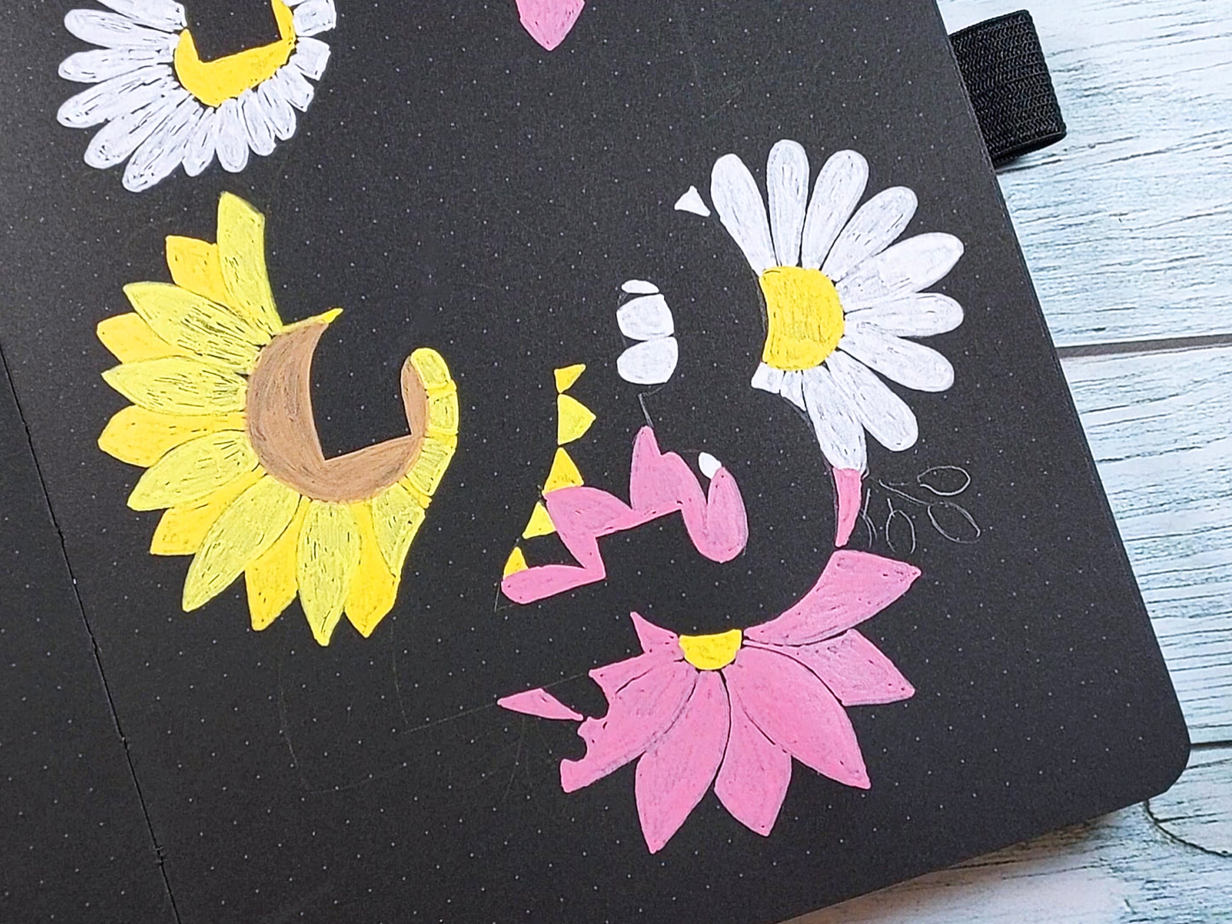
When painting the flowers be careful to respect the shapes of the numbers. As these markers have a fine tip, I like to outline the shape first and then fill it in. Besides, this way I frame the shapes well. I recommend that you paint petal by petal, because this way you will mark a separation even if they are painted with the same color. But if they are a little mixed up, don't worry because we will add details later.
You can also separate them using two different shades of the same color, as I did with the sunflower.

Once you have painted all the flowers, paint the leaves and branches as well, making sure to fill in the spaces inside the numbers. You can leave small gaps unpainted but try to make sure that most of the outline of the numbers is colored so that they read well.
I like the paint to be super opaque and have all the paper covered, so I'll give it a second coat of paint. That way I don't have to worry about getting everything perfect in the first layer.

6. ADDING THE DETAIL
When the base paint is completely dry (it takes very little time if you are using the acrylographs) you can add the details. For that I will use a different tone from the initial color to give more depth to the drawing. And in the case of the daisy, I will use a light gray. Draw some little lines to give texture to the petals of the flowers, mark some outlines if your petals are too close together, and paint the central lines of the leaves and the branches. You can also add some details to finish the composition so that the result is completely balanced.
If you make a mistake when painting any detail you can always paint over it with the initial color and start again. That's the great thing about using paint markers.
Take one last look to make sure everything is to your liking and you're done.
Pat yourself on the back for finishing the project and enjoy how nice it looks 😊

You can also watch the video with the whole process:
And if drawing isn’t your thing, I’ve created a printable for you to use for your bujo cover. Click to download now:

Thank you for following this article. If you post the result on your socials, you can tag me @miss.meissa, @archerandolive and @archerandolive.community so we can see how well it turned out. And add #AOShare and #archerandolive 😊
You can see more of my creations and videos on my Instagram and Youtube accounts or on my website.
And if you liked my tutorial I'm sure you'll love this Fun Floral Alphabet Lettering Tutorial by @essjay_florals and this Bullet Journal Flower Theme + Cover Page by Liz Gray @thegraytergood.


0 comments